What is your experience w free/$$ site templates? |
Post Reply 
|
Page <1234 5> |
| Author | |
simplyathleticgear 
Newbie 

Joined: 26-October-2009 Location: Toronto Status: Offline Points: 0 |
 Post Options Post Options
") Thanks(0) Thanks(0)
 Quote Reply Quote Reply
 Posted: 09-November-2009 at 12:48am Posted: 09-November-2009 at 12:48am |
|
Thank you for your feedback.
I may look to use some these, or at least try them.
Currently, I am working with a designer to create a logo. I'm hoping to have a logo or some concepts with the a week or so. I will keep everyone posted...hopefully I will post some samples/concepts.
Regards.
|
|
|
Martin
http://www.simplyathletic.com |
|
 |
|
|
simplyathleticgear
Newbie
Joined: 26-October-2009 Location: Toronto Status: Offline Points: 0 |
Post Options
Thanks(0)
Quote Reply
Posted: 11-November-2009 at 10:00am |
|
Hello, I have received the first draft of the logo. Not quite what I was looking for, but here it is for your viewing pleasure :)
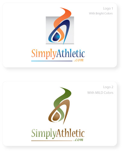
Here was my feedback to the designer: I prefer the colour scheme of logo #1. I think it's a great start, but I didn't get the "THIS IS IT!" feeling -- I'm sure you know what I mean. What if we tried to give it a more "realistic and athletic" look/feel? I'm not sure how this can be done...what if we tried using a silhouette of a person "in action"? Also, the "blue dot" in the logo is powerful...too powerful, so it should not be the main eye catcher of the logo. This needs to be taken out or incorporated differently (I understand that it is the horizontal part of the "A", but the eye focuses on it too much.) Also, the wrong site name is in the logo (simplyathleticgear.com -- simplyathletic.com was registered). In brief, the vision statement is the following: "To be the leading online retailer of athletic equipment by providing quality products and exceptional service." I know that there are many experts here, so I would appreciate any additional feedback! Regards. Edited by simplyathleticgear - 11-November-2009 at 10:09am |
|
|
Martin
http://www.simplyathletic.com |
|
|
|
|
katharina
Senior Member 

Joined: 25-October-2005 Location: United States Status: Offline Points: 0 |
Post Options
Thanks(0)
Quote Reply
Posted: 11-November-2009 at 10:24am |
|
I get the first one and actually like it. I see red (its more orange) for exercise or burning calories, and blue for a healthy lifestyle. I also get the shapes of the colors. I would say add the G in green (for perhaps outdoor activity) and you have a nice logo.
Lust my little input. |
|
|
Katharina
******************* www.GermanPlaza.com ******************* |
|
|
|
|
simplyathleticgear
Newbie
Joined: 26-October-2009 Location: Toronto Status: Offline Points: 0 |
Post Options
Thanks(0)
Quote Reply
Posted: 11-November-2009 at 10:52am |
|
That's awesome feedback...I like how you connected the colours to "exercise" and blue to "healthy lifestyle"...and green for "outdoor". I never thought of positioning the company brand in this way, but I like it.
What do you think about incorporating "gears" into the logo? This would be to help give a more visual representation of the site name. For example, a silhouette of a person, but the person is made up of gears? I don't know, I'm just thinking on my feet. Thanks. |
|
|
Martin
http://www.simplyathletic.com |
|
|
|
|
simplyathleticgear
Newbie
Joined: 26-October-2009 Location: Toronto Status: Offline Points: 0 |
Post Options
Thanks(0)
Quote Reply
Posted: 11-November-2009 at 10:58am |
|
...mind you, I'm not sure if the concept of 'gears' can be incorporated into the first concept without making it too busy...
Regards. |
|
|
Martin
http://www.simplyathletic.com |
|
|
|
|
intour
Senior Member
Joined: 30-June-2006 Location: United Kingdom Status: Offline Points: 0 |
Post Options
Thanks(0)
Quote Reply
Posted: 11-November-2009 at 10:59am |
|
I agree with Katharina on the colours. The word 'Athletic' would suggest something more vibrant.
I also can't resist making a note of Katharinas last post 'Lust my little input' !
Nigel
|
|
|
|
|
simplyathleticgear
Newbie
Joined: 26-October-2009 Location: Toronto Status: Offline Points: 0 |
Post Options
Thanks(0)
Quote Reply
Posted: 11-November-2009 at 11:02am |
|
lol...good catch @intour :)
Red = Energy / Burning Calories Blue = Athletic / Athleticism Green = Healthy Living Thoughts? |
|
|
Martin
http://www.simplyathletic.com |
|
|
|
|
Hamish
Admin Group 
Joined: 12-October-2006 Location: United Kingdom Status: Offline Points: 56 |
Post Options
Thanks(0)
Quote Reply
Posted: 11-November-2009 at 11:04am |
|
I'm no design expert, but here's my two cents worth.
The logo, with the words underneath is quite "tall", so in your sites header it would either need to be quite small, or you would end up with a tall header, taking a lot of screen space. Of course that comment is completely dependent on your site design! One option, have a variation with the text to the side. - I can see the logo has energy, but If I was presented with either of them without the text I would think of : - For the first one, water into steam? Cooking / Energy ?? - For the second, A coffee brand perhaps. |
|
|
|
|
simplyathleticgear
Newbie
Joined: 26-October-2009 Location: Toronto Status: Offline Points: 0 |
Post Options
Thanks(0)
Quote Reply
Posted: 11-November-2009 at 11:10am |
|
That's a good point @Hamish. Most people will only see the picture/image, so this is great feedback...I have passed it on to the designer.
Your comment enforces my original request to the designer to make it more "athletic" or "sporty"...curious to see what he comes up with. Regards. |
|
|
Martin
http://www.simplyathletic.com |
|
|
|
|
Guests
Guest 
|
Post Options
Thanks(0)
Quote Reply
Posted: 11-November-2009 at 1:27pm |
Ditto. This is exactly my concern here. You want to be conscious of the page real estate the logo is taking up, especially in terms of the height it is forcing the header to be. There is a relatively limited amount of space "above the fold" you have to really pull a visitor in, so you don't want your header wasting much of that. Ideally I try to keep headers down to 90 px, but never more than 120 px if at all possible.
|
|
|
|
|
Post Reply
|
Page <1234 5> |
 Tweet
Tweet
|
| Forum Jump | Forum Permissions You cannot post new topics in this forum You cannot reply to topics in this forum You cannot delete your posts in this forum You cannot edit your posts in this forum You cannot create polls in this forum You cannot vote in polls in this forum |


 Topic Options
 Hamish wrote: