What is your experience w free/$$ site templates? |
Post Reply 
|
Page <12345> |
| Author | |
simplyathleticgear 
Newbie 

Joined: 26-October-2009 Location: Toronto Status: Offline Points: 0 |
 Post Options Post Options
") Thanks(0) Thanks(0)
 Quote Reply Quote Reply
 Posted: 12-November-2009 at 9:46am Posted: 12-November-2009 at 9:46am |
|
Hello,
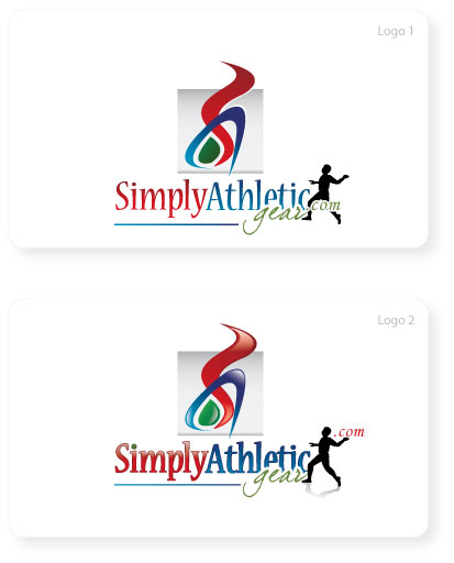
Here is the next revision...not all the requirements have been met, but I'd like your feedback nonetheless:
 Regards. Edited by simplyathleticgear - 12-November-2009 at 11:20am |
|
|
Martin
http://www.simplyathletic.com |
|
 |
|
|
Hamish
Admin Group 
Joined: 12-October-2006 Location: United Kingdom Status: Offline Points: 56 |
Post Options
Thanks(0)
Quote Reply
Posted: 12-November-2009 at 10:35am |
|
Hi,
The height is still an issue, but you could have a variation like :  Excuse the exceeding quick cut & paste edit! I prefer the "3d" colors in the second, but consideration probably has to be given to it's use on other media as well such as headed paper, company branded clothing etc. I think the figure of the person makes it look busy and doesn't add anything - It's not even clear what they are doing anyway, skipping? :-) Having the grey block behind the graphic seems to isolate it from the text section of the logo, so it seems like a pair of logos - Even more so when/if the text is at the side! IMHO (Extremely H) it either needs to extend behind the text as well or disappear. Don't forget though, your graphics person is just that and I'm NOT a graphics person. |
|
|
|
|
katharina
Senior Member 

Joined: 25-October-2005 Location: United States Status: Offline Points: 0 |
Post Options
Thanks(0)
Quote Reply
Posted: 12-November-2009 at 11:06am |
|
Man, you beat me to it. I was going to suggest the same thing with the curvy part. Use it next to the logo instead above. I would also use the second logo, since the 3-D effect makes it more vibrant and gives the feel of motion. I would continue the grey shade behind the whole thing. I would also suggest to get a clean copy of the curvy part itself. You could use it as part of your buttons etc. This will tie the whole site together.
|
|
|
Katharina
******************* www.GermanPlaza.com ******************* |
|
|
|
|
simplyathleticgear
Newbie
Joined: 26-October-2009 Location: Toronto Status: Offline Points: 0 |
Post Options
Thanks(0)
Quote Reply
Posted: 12-November-2009 at 11:24am |
|
Thank you both for your feedback.
@Hamesh, I agree with the "busy" part...the two images are not in harmony...
@katharina, great thought on using the colour for buttons and using other parts of the logo in the layout.
The idea of the person was to make it more "athletic", but at the same time had to be independent of any sport as I will keep expanding my product list...but it may be adding too much comlexity.
Thanks again...I will keep the revisions coming. Edited by simplyathleticgear - 12-November-2009 at 11:28am |
|
|
Martin
http://www.simplyathletic.com |
|
|
|
|
simplyathleticgear
Newbie
Joined: 26-October-2009 Location: Toronto Status: Offline Points: 0 |
Post Options
Thanks(0)
Quote Reply
Posted: 13-November-2009 at 11:10am |
|
Hello, here is the next revision...still didn't address the height of the logo, but I like the figure better...not sure how I feel about the dot in the image...thoughts?
I'm not sure why, but I'm still not feeling this logo 100%. I think my preference is towards #1. I can see the grey background posing problems with the layout/background of the site. Perhaps do away with the grey all together?
Do you have any thoughts on the "S" and "A" picture? What if that was taken out completely? Hmm...I like the idea of having an image so that it can be used on a jersey and other print.
Your thoughts would be appreciated.
Regards.
 |
|
|
Martin
http://www.simplyathletic.com |
|
|
|
|
Greg Dinger
Certified ProductCart Developers 

Joined: 23-September-2006 Location: United States Status: Offline Points: 238 |
Post Options
Thanks(0)
Quote Reply
Posted: 13-November-2009 at 11:16am |
|
Lose the thing on the top and just keep the bottom. You resolve the height issue, the top piece seems like unnecessary fluff, and you can move on to your design.
|
|
|
|
|
katharina
Senior Member
Joined: 25-October-2005 Location: United States Status: Offline Points: 0 |
Post Options
Thanks(0)
Quote Reply
Posted: 13-November-2009 at 11:18am |
|
I like the second one more, but would eliminate the wiggly stuff above. It just makes it to tall. I would not put it in front at this point, because it may interfere with the readability of the word simply. It also makes the logo too wide. Use the wiggle stuff elsewhere on the site for color etc.
|
|
|
Katharina
******************* www.GermanPlaza.com ******************* |
|
|
|
|
Hamish
Admin Group
Joined: 12-October-2006 Location: United Kingdom Status: Offline Points: 56 |
Post Options
Thanks(0)
Quote Reply
Posted: 13-November-2009 at 11:22am |
|
Hi Martin,
I'd keep the graphic. Losing the grey is not a bad idea. The athlete character looks much more like an athlete now :-) I've no particular opinion on the dot, except that the diamond in the second one does not look right. |
|
|
|
|
simplyathleticgear
Newbie
Joined: 26-October-2009 Location: Toronto Status: Offline Points: 0 |
Post Options
Thanks(0)
Quote Reply
Posted: 13-November-2009 at 11:49am |
|
Thank you everyone for your feedback...here is my MS Paint attempt...what do you think?
 ...minus the grey background.
|
|
|
Martin
http://www.simplyathletic.com |
|
|
|
|
katharina
Senior Member
Joined: 25-October-2005 Location: United States Status: Offline Points: 0 |
Post Options
Thanks(0)
Quote Reply
Posted: 13-November-2009 at 11:54am |
|
Too busy. Go with the last one, minus the squiggle, plus the grey shading.
|
|
|
Katharina
******************* www.GermanPlaza.com ******************* |
|
|
|
|
Post Reply
|
Page <12345> |
 Tweet
Tweet
|
| Forum Jump | Forum Permissions You cannot post new topics in this forum You cannot reply to topics in this forum You cannot delete your posts in this forum You cannot edit your posts in this forum You cannot create polls in this forum You cannot vote in polls in this forum |


 Topic Options