What is your experience w free/$$ site templates?
Printed From: ProductCart E-Commerce Solutions
Category: ProductCart
Forum Name: Customizing ProductCart
Forum Description: Exchange messages with other users that are customizing ProductCart.
URL: https://forum.productcart.com/forum_posts.asp?TID=3145
Printed Date: 22-April-2026 at 4:21pm
Software Version: Web Wiz Forums 12.04 - http://www.webwizforums.com
Topic: What is your experience w free/$$ site templates?
Posted By: simplyathleticgear
Subject: What is your experience w free/$$ site templates?
Date Posted: 26-October-2009 at 8:18pm
|
Hello Everyone:
I'm very excited about ProductCart as I plan to deploy my first site over the next few months  . My background is in development, but my concern is that I don't have much experience with image editing and site design. In short, I'm comfortable diving into the ASP to customize at will, but creating the site layout is a whole other ball game. . My background is in development, but my concern is that I don't have much experience with image editing and site design. In short, I'm comfortable diving into the ASP to customize at will, but creating the site layout is a whole other ball game.
This brings me to my approach: My hope is to use a template for the site (free or purchased). With this in mind, I have a question for all the brilliant minds that reside in the forum. What is your experience with using HTML/CSS templates to integrate with ProductCart? Is there anything in particular that I should be aware of or watch out for? E.g. Are there certain layouts that do not lend themselves well to ProductCart? Thank you all in advance for your help and wisdom on this topic. Cheers, Martin. |
Replies:
Posted By: Greg Dinger
Date Posted: 26-October-2009 at 8:41pm
Posted By: Guests
Date Posted: 26-October-2009 at 10:24pm
|
Hi Martin,
Not at all uncommon -- rather actually the norm -- that we developers aren't great at graphic arts and the finer elements of site design (myself included; which is why my partner is the lead on graphic arts and design). However, designers should be well aware of/familiar with the application they are designing for. That is, you'd do well to hook up with a designer familiar with ProductCart.
There are quite a few talented designers in the ProductCart community, and a few who really know their XHTML/CSS and have serious talent. PM me and I could make some recommendations.
As for "free" or "low cost" templates, in our experience, as they are not designed for the application in hand, they often take as much time to redesign for the intended application as it would cost to take a concept you like and design from scratch for the applicaton you want to apply it to -- in this case, ProductCart (I sense this is similar to Greg's reference to ~ 12 hrs to integrate one of these types of design templates).
Keep in mind that these kinds of templates are not taking into consideration the unique functionality of the application you are wanting to apply them to, and can typically be more struggle to get them to apply than is worth the effort.
What's more, IMHO, templates almost always look like . . . well, templates. Unless your clients are seriously scraping the bottom, it's almost always better to consider their business first, and then design a site theme for that.
Finally, while ProductCart is rather independent of design, at some point you do have to maintain design coherency once you get into the shopping cart functionality. It's best to have a design concept that will work consitantly accross the entire site from home page to order confirmation.
|
Posted By: simplyathleticgear
Date Posted: 26-October-2009 at 11:29pm
|
Gentlemen, thank you for your replies. I echo your thoughts...that a successful site must have a rock-solid design and layout.
The eCommerce site that I'd like to deploy is not for a client, it's something that I've wanted to do for the longest time so I'm finally getting around to getting the job done! I owe myself the justice to at least inquire at the cost to have a professionally designed template/layout for the site...thanks again. Regards, Martin. ------------- Martin http://www.simplyathletic.com |
Posted By: simplyathleticgear
Date Posted: 28-October-2009 at 11:53am
|
Hello All,
Alright...I will attempt to do something that I have never done before - create my own site layout.
As eluded to by Sean above, I imagine that many people are strong in one skill and perhaps weaker in the other (development vs design). As such, what I can do is use this thread to give everyone a running account of my progress from a developers perspective (on creating a site layout)? Mind you, I do have a full-time job, so this is really a pet project, but nonetheless, hopefully I can deliver a site sooner rather than later (although it may still be months away as I need to develop my buiness model Thoughts are more than welcome... ------------- Martin http://www.simplyathletic.com |
Posted By: katharina
Date Posted: 28-October-2009 at 12:04pm
|
I encourage you to try. It is not that hard. I'm not a developer nor a designer. What I did was create a look in my webpage editing program (netobjects fusion), with buttons and all. I've also created the links from the buttons to various parts like new arrivals, customer log in, and support pages. These links can be get from the back office, and also compare them to what is in the template as for linking. Create other files like your terms etc in the back end so it also creates links for those files. Add the few tags EI has for the header and a place note for yourself as where to split the html file later into the header and footer asp pages. Basic html knowledge with help when it comes to reading html tags in the final file. I think it took me less then one hour for my first template with an older version. For the last one I needed a little bit more, due to cascading styles. Good luck. ------------- Katharina ******************* www.GermanPlaza.com ******************* |
Posted By: simplyathleticgear
Date Posted: 28-October-2009 at 8:56pm
|
Hello,
Before I embark on the endeavour to create a layout, I need a starting point. With that said, I'm on a mission to create a logo. With a logo I hope to be able to ensure that the layout is in cohesion with the company brand. As mentioned above, I'm no graphic expert. Therefore, I'm looking at using a third party such as Logo Design Team (http://www.LogoDesignTeam.com) to come up with a logo. I'm looking at their $149 package...seems more than reasonable for five designs and unlimited revisions. Until next time... Cheers. ------------- Martin http://www.simplyathletic.com |
Posted By: Guests
Date Posted: 28-October-2009 at 9:23pm
|
Excellent approach. We always start with the logo as it communicates SO MUCH including color scheme, "mood", "character", etc. The logo is our cornerstone for site design.
And frankly, serious logo design is an art in and of itself. There is a lot of skill and experience that goes into it, and you really want a deliverable that can be used effectively in all manner of media.
A logo design house is a good option, but one word of caution whith these logo design services -- you will almost get upgraded to a more expensive package than you were likely expecting. However, even then you won't typically come out any more expensive than when dealing directly with a logo design artist.
|
Posted By: Andy @ Landmarq
Date Posted: 02-November-2009 at 6:38am
|
Not being the most gifted person artistic wise, I went with the template method and grabbed one from here http://www.freecsstemplates.org/ It took a couple of hours to spread the rough layout into the header/footer and content style for product cart and about a day to convert the rest of the pages and I'm forever tweaking it about just to pretty things up and add new features but the end result looks good. The template I went for was originally intended for a blog site rather than a shopping site but the colour scheme fitted what we wanted and the layout was quite smart so templates can work if you can find one you feel will sit well with your sites content. ------------- Need a bespoke PC built to order? come to www.landmarq.co.uk |
Posted By: intour
Date Posted: 06-November-2009 at 5:21am
|
There is another option which saves a lot of time and money and can save you being totally dependent on a preconfigured design.
You can buy or get for free a CSS layout tool. This creates you standards complaint CSS layouts so you have your basic 2 column or 3 column layout, fluid (to fill the screen) or fixed width centered etc etc.
You do need some CSS knowledge but it's not too difficult to learn the basics. You can than tweak the layout to suit your design, add header, footer and background images and then add your code and menus.
Even for experienced website designers these type of tools are great timesavers.
Nigel
------------- http://www.innerview.co.uk - Innerview Productcart Platinum Reseller Web Design/Hosting/Virtual Tours |
Posted By: simplyathleticgear
Date Posted: 09-November-2009 at 12:48am
|
Thank you for your feedback.
I may look to use some these, or at least try them.
Currently, I am working with a designer to create a logo. I'm hoping to have a logo or some concepts with the a week or so. I will keep everyone posted...hopefully I will post some samples/concepts.
Regards. ------------- Martin http://www.simplyathletic.com |
Posted By: simplyathleticgear
Date Posted: 11-November-2009 at 10:00am
Hello, I have received the first draft of the logo. Not quite what I was looking for, but here it is for your viewing pleasure :)
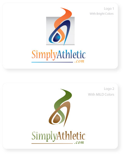
Here was my feedback to the designer: I prefer the colour scheme of logo #1. I think it's a great start, but I didn't get the "THIS IS IT!" feeling -- I'm sure you know what I mean. What if we tried to give it a more "realistic and athletic" look/feel? I'm not sure how this can be done...what if we tried using a silhouette of a person "in action"? Also, the "blue dot" in the logo is powerful...too powerful, so it should not be the main eye catcher of the logo. This needs to be taken out or incorporated differently (I understand that it is the horizontal part of the "A", but the eye focuses on it too much.) Also, the wrong site name is in the logo (simplyathleticgear.com -- simplyathletic.com was registered). In brief, the vision statement is the following: "To be the leading online retailer of athletic equipment by providing quality products and exceptional service." I know that there are many experts here, so I would appreciate any additional feedback! Regards. ------------- Martin http://www.simplyathletic.com |
Posted By: katharina
Date Posted: 11-November-2009 at 10:24am
|
I get the first one and actually like it. I see red (its more orange) for exercise or burning calories, and blue for a healthy lifestyle. I also get the shapes of the colors. I would say add the G in green (for perhaps outdoor activity) and you have a nice logo. Lust my little input. ------------- Katharina ******************* www.GermanPlaza.com ******************* |
Posted By: simplyathleticgear
Date Posted: 11-November-2009 at 10:52am
|
That's awesome feedback...I like how you connected the colours to "exercise" and blue to "healthy lifestyle"...and green for "outdoor". I never thought of positioning the company brand in this way, but I like it.
What do you think about incorporating "gears" into the logo? This would be to help give a more visual representation of the site name. For example, a silhouette of a person, but the person is made up of gears? I don't know, I'm just thinking on my feet. Thanks. ------------- Martin http://www.simplyathletic.com |
Posted By: simplyathleticgear
Date Posted: 11-November-2009 at 10:58am
|
...mind you, I'm not sure if the concept of 'gears' can be incorporated into the first concept without making it too busy...
Regards. ------------- Martin http://www.simplyathletic.com |
Posted By: intour
Date Posted: 11-November-2009 at 10:59am
|
I agree with Katharina on the colours. The word 'Athletic' would suggest something more vibrant.
I also can't resist making a note of Katharinas last post 'Lust my little input' !
Nigel
------------- http://www.innerview.co.uk - Innerview Productcart Platinum Reseller Web Design/Hosting/Virtual Tours |
Posted By: simplyathleticgear
Date Posted: 11-November-2009 at 11:02am
|
lol...good catch @intour :)
Red = Energy / Burning Calories Blue = Athletic / Athleticism Green = Healthy Living Thoughts? ------------- Martin http://www.simplyathletic.com |
Posted By: Hamish
Date Posted: 11-November-2009 at 11:04am
|
I'm no design expert, but here's my two cents worth. The logo, with the words underneath is quite "tall", so in your sites header it would either need to be quite small, or you would end up with a tall header, taking a lot of screen space. Of course that comment is completely dependent on your site design! One option, have a variation with the text to the side. - I can see the logo has energy, but If I was presented with either of them without the text I would think of : - For the first one, water into steam? Cooking / Energy ?? - For the second, A coffee brand perhaps. ------------- Editing ProductCart Code? See http://wiki.earlyimpact.com/developers/editcode" rel="nofollow - WIKI Guidelines for Editing ProductCart's ASP Source Code |
Posted By: simplyathleticgear
Date Posted: 11-November-2009 at 11:10am
|
That's a good point @Hamish. Most people will only see the picture/image, so this is great feedback...I have passed it on to the designer.
Your comment enforces my original request to the designer to make it more "athletic" or "sporty"...curious to see what he comes up with. Regards. ------------- Martin http://www.simplyathletic.com |
Posted By: Guests
Date Posted: 11-November-2009 at 1:27pm
Ditto. This is exactly my concern here. You want to be conscious of the page real estate the logo is taking up, especially in terms of the height it is forcing the header to be. There is a relatively limited amount of space "above the fold" you have to really pull a visitor in, so you don't want your header wasting much of that. Ideally I try to keep headers down to 90 px, but never more than 120 px if at all possible.
|
Posted By: simplyathleticgear
Date Posted: 12-November-2009 at 9:46am
|
Hello,
Here is the next revision...not all the requirements have been met, but I'd like your feedback nonetheless:
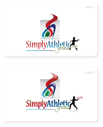 Regards. ------------- Martin http://www.simplyathletic.com |
Posted By: Hamish
Date Posted: 12-November-2009 at 10:35am
|
Hi, The height is still an issue, but you could have a variation like :  Excuse the exceeding quick cut & paste edit! I prefer the "3d" colors in the second, but consideration probably has to be given to it's use on other media as well such as headed paper, company branded clothing etc. I think the figure of the person makes it look busy and doesn't add anything - It's not even clear what they are doing anyway, skipping? :-) Having the grey block behind the graphic seems to isolate it from the text section of the logo, so it seems like a pair of logos - Even more so when/if the text is at the side! IMHO (Extremely H) it either needs to extend behind the text as well or disappear. Don't forget though, your graphics person is just that and I'm NOT a graphics person. ------------- Editing ProductCart Code? See http://wiki.earlyimpact.com/developers/editcode" rel="nofollow - WIKI Guidelines for Editing ProductCart's ASP Source Code |
Posted By: katharina
Date Posted: 12-November-2009 at 11:06am
|
Man, you beat me to it. I was going to suggest the same thing with the curvy part. Use it next to the logo instead above. I would also use the second logo, since the 3-D effect makes it more vibrant and gives the feel of motion. I would continue the grey shade behind the whole thing. I would also suggest to get a clean copy of the curvy part itself. You could use it as part of your buttons etc. This will tie the whole site together. ------------- Katharina ******************* www.GermanPlaza.com ******************* |
Posted By: simplyathleticgear
Date Posted: 12-November-2009 at 11:24am
|
Thank you both for your feedback.
@Hamesh, I agree with the "busy" part...the two images are not in harmony...
@katharina, great thought on using the colour for buttons and using other parts of the logo in the layout.
The idea of the person was to make it more "athletic", but at the same time had to be independent of any sport as I will keep expanding my product list...but it may be adding too much comlexity.
Thanks again...I will keep the revisions coming. ------------- Martin http://www.simplyathletic.com |
Posted By: simplyathleticgear
Date Posted: 13-November-2009 at 11:10am
|
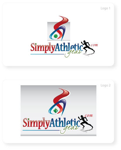
Hello, here is the next revision...still didn't address the height of the logo, but I like the figure better...not sure how I feel about the dot in the image...thoughts?
I'm not sure why, but I'm still not feeling this logo 100%. I think my preference is towards #1. I can see the grey background posing problems with the layout/background of the site. Perhaps do away with the grey all together?
Do you have any thoughts on the "S" and "A" picture? What if that was taken out completely? Hmm...I like the idea of having an image so that it can be used on a jersey and other print.
Your thoughts would be appreciated.
Regards.
 ------------- Martin http://www.simplyathletic.com |
Posted By: Greg Dinger
Date Posted: 13-November-2009 at 11:16am
Posted By: katharina
Date Posted: 13-November-2009 at 11:18am
|
I like the second one more, but would eliminate the wiggly stuff above. It just makes it to tall. I would not put it in front at this point, because it may interfere with the readability of the word simply. It also makes the logo too wide. Use the wiggle stuff elsewhere on the site for color etc. ------------- Katharina ******************* www.GermanPlaza.com ******************* |
Posted By: Hamish
Date Posted: 13-November-2009 at 11:22am
|
Hi Martin, I'd keep the graphic. Losing the grey is not a bad idea. The athlete character looks much more like an athlete now :-) I've no particular opinion on the dot, except that the diamond in the second one does not look right. ------------- Editing ProductCart Code? See http://wiki.earlyimpact.com/developers/editcode" rel="nofollow - WIKI Guidelines for Editing ProductCart's ASP Source Code |
Posted By: simplyathleticgear
Date Posted: 13-November-2009 at 11:49am
Thank you everyone for your feedback...here is my MS Paint attempt...what do you think?
 ...minus the grey background. ------------- Martin http://www.simplyathletic.com |
Posted By: katharina
Date Posted: 13-November-2009 at 11:54am
|
Too busy. Go with the last one, minus the squiggle, plus the grey shading. ------------- Katharina ******************* www.GermanPlaza.com ******************* |
Posted By: Greg Dinger
Date Posted: 13-November-2009 at 12:08pm
|
I agree. Keep it simple. ------------- GreyBeard Design Group Certified ProductCart Developer Web Design/Development/Hosting http://tinyurl.com/5c8t4t" rel="nofollow - Add-Ons & Custom Code | |
Posted By: Hamish
Date Posted: 13-November-2009 at 12:12pm
|
Ditto.
------------- Editing ProductCart Code? See http://wiki.earlyimpact.com/developers/editcode" rel="nofollow - WIKI Guidelines for Editing ProductCart's ASP Source Code |
Posted By: simplyathleticgear
Date Posted: 17-November-2009 at 12:12am
|
Hello Everyone, here is a concept from another designer. I like it...it's simple and modern.
 On a side note, I was able to register simplyathletix.com, so I'm going to revise the logo to reflect the new site name. I'm thinking that the 'x' should be the same colour as the word 'simply'.
Thanks for all your help so far!
Regards. ------------- Martin http://www.simplyathletic.com |
Posted By: Guests
Date Posted: 17-November-2009 at 2:22am
|
I'm a firm believer in the simplicity of logos, especially when it comes to branding in all media. Trite as it may seem, take the "gold arches" - I mean, I don't even have to show you a picture of that and you already know it's McDonalds. UPS has even trademarked the color "brown"!
I like this log A LOT better than the earlier stuff. . . but it's still missling something . . . .
Maybe put "athletic" in an italic font to communicate motion and rathched downe the "gear" quite a bit. "Simply Athletic" should be the focus, not "GEAR".
I absolutely love the more abstract athletic person iconography here than anything prior to this. Frankly, I think you are on to a better logo designer now, one who understandands that logos are about branding and media and so much more. The last one was more about being fancy with graphics, which is not what you really want at the end of the day all around, even if it would make your website (alone) look cool.
On the issue of domain names, are you saying you don't have simplyathleticgear.com registered? If not, then kick this issue around more here . . . but if you do own that domain name, I'd advise against simplyathelitix.com for many SEO reasons. Just to start, "athletic gear" is a much better SEO phrase than "athletix".
PS: Thanks for sharing your experience here -- there are more foks following this thread than you would imagine ;-)
|
Posted By: Hamish
Date Posted: 17-November-2009 at 6:18am
|
Hi, The new logo is a big improvement. I agree completely with Sean. ------------- Editing ProductCart Code? See http://wiki.earlyimpact.com/developers/editcode" rel="nofollow - WIKI Guidelines for Editing ProductCart's ASP Source Code |
Posted By: simplyathleticgear
Date Posted: 17-November-2009 at 9:21am
|
Hello Again. mailto:Sean@WMS - Sean@WMS : Thank you very much for your feedback - especially regarding the SEO challenges of the domain name. I am having difficulty in deciding which domain name to go with. I want my site to portray a professional image/brand that sells premium and quality sports products with exceptional service. Here are the domain names that I have registered for the business: Based on your feedback, I imagine that either "simplyathleticgear", "purelyathletic" are my best options. What are your thoughts on this? Thank you for your note of appreciation for this thread. I was mildly concerned that the ProductCart forum admin(s) may not see this thread in the same light and that they would ask me to cease and desist. @Hamesh: Thank you for following this thread as well. Regards. ------------- Martin http://www.simplyathletic.com |
Posted By: katharina
Date Posted: 17-November-2009 at 10:30am
|
I like the new logo, and don't see an issue with the arches. I still like the old logo too, but this one will show better on letterheads, and other printed matter as well. I'm personally against words that are misspelled or off in some way. I know it goes with the internet thing, but I feel that this makes you look less professional. Plus you will have to promote something spelled off and you have to explain to others how to spell it so they don't end up on the competitors site. So in my point the x is a bad idea. Stick with the slightly longer domain name, because it is spelled correctly, can be remembered, and does not have to be explained.
------------- Katharina ******************* www.GermanPlaza.com ******************* |
Posted By: Hamish
Date Posted: 17-November-2009 at 10:44am
|
Hi, I hope it was you who registered the domains? : purelyathletic.com/ca truelyathletic.com/ca simplyathletic.com/ca Are you Kaczynski Enterprises ? I hope so! A shorter, but meaningful, domain name is almost always better. Easier for people to remember & type, communicate etc, so dropping "gear" is a good move. ------------- Editing ProductCart Code? See http://wiki.earlyimpact.com/developers/editcode" rel="nofollow - WIKI Guidelines for Editing ProductCart's ASP Source Code |
Posted By: simplyathleticgear
Date Posted: 17-November-2009 at 2:56pm
|
@katharina: Thank you for your feedback...I am now seeing the light with respect to the 'x' in the name.
@Hamish: Yes, these are registered to me. I'm leaning towards simplyathletic for the main site and the others redirecting to it.
Thoughts on the name?
Regards. ------------- Martin http://www.simplyathletic.com |
Posted By: simplyathleticgear
Date Posted: 18-November-2009 at 1:42pm
|
Hello, here are the two latest revisions.
 I still like the first one better and have asked the designer to keep to the first design and see if she can try to work with it to give it some more "speed", "agility", "motion", "athleticism", etc.
I think I'm in the home stretch with the logo :)
Regards. ------------- Martin http://www.simplyathletic.com |
Posted By: simplyathleticgear
Date Posted: 19-November-2009 at 3:53pm
|
Hello, here is the final logo!
 My immediate next step is now to share this with another designer to get the layout going!
Thank you for all of your input thus far. I will keep you abreast of my layout creation journey.
Regards, Martin. ------------- Martin http://www.simplyathletic.com |
Posted By: joshs
Date Posted: 27-November-2009 at 4:26pm
|
I have visited the site for a couple weeks and hadn't read the up to date posts on this thread. This might be a little late in your decision making process but simple is best. My first thought is that some people will have a hard time spelling "athletic." I know that is weird but if they see an advertisement and try to type in your url they might end up with other variations. FYI www.athleticgear.com is for sale. What does simply athletic gear mean? What are you selling? How about www.simplyrunninggear.com or simply football gear? Are you selling all kinds and variations of athletic gear? Marketing wise it seems that clearly defined markets will seo better to start off. |
Posted By: katharina
Date Posted: 27-November-2009 at 5:08pm
|
Ok, you've got me with this one. To me it's not a problem spelling it, and my native language is German. So, I've tested my hubby. Born and raised in New Jersey and somewhat dyslexic. He passed all University level English writing and composition tests with an A. Many of the classes he did not even have to take, because he passed the tests. Smart man, but can't spell for nothing. Hey they have computers so he doesn't need to. He is a great story writer never the less. So I asked him and sure enough he cannot spell it right. That proofs your point, and that america's reading and spelling level is not that good either. I've read somewhere that America's level is that of an 8th grader. Not saying that other countries are smarter. Just a sad statistic. ------------- Katharina ******************* www.GermanPlaza.com ******************* |
 Hamish wrote: